
본 포스팅은 kaggle : Geospatial Analysis을 수료하고 정리한 글입니다.
3. Interactive Maps
이 튜토리얼에서는 folium 패키지를 사용하여 대화형 지도를 만드는 방법에 대해 배우게 된다. 대화형 지도란 사용자가 지도 위의 요소를 클릭하거나 드래그하거나 특정 위치를 클릭할 경우 해당 위치를 확인할 수 있는 지도이다. 보스턴 지역의 범죄 데이터를 시각화함으로써 folium에 대해 학습해보자
import folium
from folium import Choropleth, Circle, Marker
from folium.plugins import HeatMap, MarkerCluster

m_1 = folium.Map(location=[42.32,-71.0589], tiles='openstreetmap', zoom_start=10)

m_1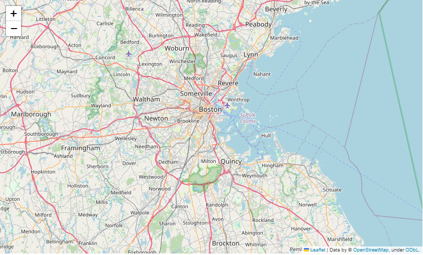
간단한 지도를 생성하는 코드이다. folium.Map() 에는 대표적인 매개변수로는
location: 지도의 초기 중심 위치 설정(위도, 경도)tiles: 타일의 뜻은 작은 이미지 조각으로 나누어진 지도의 부분을 나타낸다. 위에서는 기본 타일인 OpenStreetMap을 사용했다. Mapbox Bright, Stamen Terrian, CartoDB posiron 등이 있다.zoom_start: 지도의 확대/축소를 설정한다. 값이 높을수록 지도가 더 가까이 확대된다.
3.1 Plotting points
이제 지도에 범죄 데이터를 추가해보자. 데이터 로딩 단계는 앞서 많이 봤기 때문에 스킵하고 데이터가 로드되었다고 가정하고 진행~
daytime_robberies = crimes[((crimes.OFFENSE_CODE_GROUP == 'Robbery') & \
(crimes.HOUR.isin(range(9,18))))]
# 지도 생성
m_2 = folium.Map(location=[42.32,-71.0589], tiles='cartodbpositron', zoom_start=13)
# 지도에 마커 추가
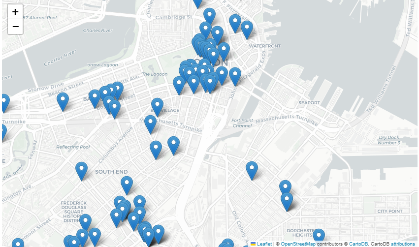
for idx, row in daytime_robberies.iterrows():
Marker([row['Lat'], row['Long']]).add_to(m_2)
m_2 folium.Marker()를 사용하여 지도에 마커를 추가한다. 각 마커에는 주간 강도 범죄가 발생한 위치데이터가 들어있다.
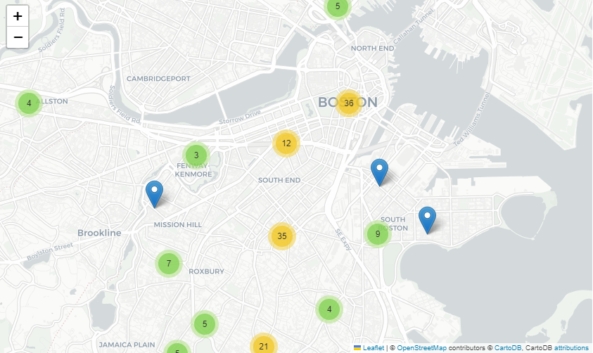
많은 수의 마커를 추가할 때 folium.plugins.MarkerCluser()를 사용하면 지도를 깔끔하게 유지하는데 도움이 된다. 각 마커는 MarkerCluster 객체에 추가된다.
# 지도 생성
m_3 = folium.Map(location=[42.32,-71.0589], tiles='cartodbpositron', zoom_start=13)

# 지도에 마커 추가
mc = MarkerCluster()
for idx, row in daytime_robberies.iterrows():
    if not math.isnan(row['Long']) and not math.isnan(row['Lat']):
        mc.add_child(Marker([row['Lat'], row['Long']]))
m_3.add_child(mc)

m_3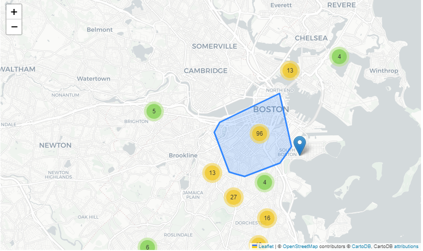
다음과 같이 나타나며, 지도 확대 시 아래 그림과 같이 변화한다.
3.2 Bubble maps
Bubble maps은 마커 대신 원을 사용한다. 각 원의 크기와 색상을 다르게 함으로써 위치와 두 가지 다른 변수 간의 관계를 나타낼 수 있다.folium.Circle()을 사용하여 원을 반복적으로 추가함으로써 Bubble map을 생성한다.
# 지도 생성
m_4 = folium.Map(location=[42.32,-71.0589], tiles='cartodbpositron', zoom_start=13)

# 12시 이전은 forestgreen , 나머지는 darkred
def color_producer(val):
    if val <= 12:
        return 'forestgreen'
    else:
        return 'darkred'

# location - 위경도 위치 리스트
# radisu - 원 반지름
for i in range(0,len(daytime_robberies)):
    Circle(
        location=[daytime_robberies.iloc[i]['Lat'], daytime_robberies.iloc[i]['Long']],
        radius=20,
        color=color_producer(daytime_robberies.iloc[i]['HOUR'])).add_to(m_4)

m_4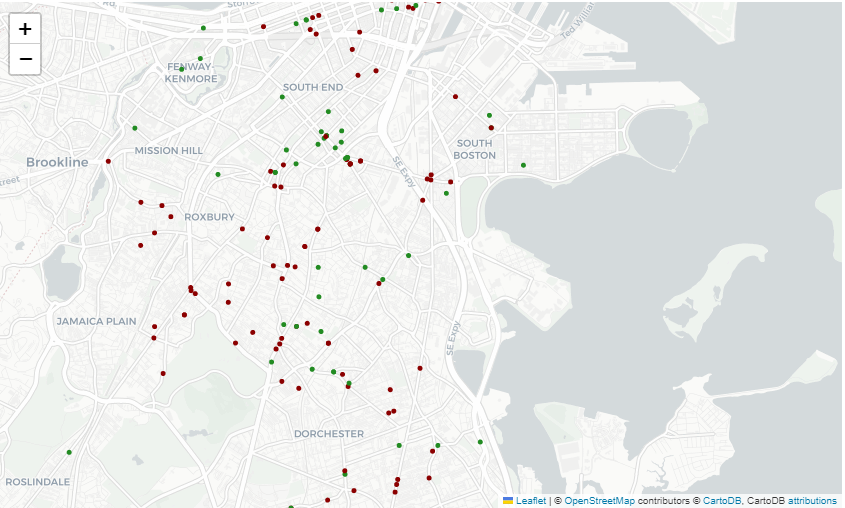
folium.Circle()에 매개변수로는
location: 지도의 초기 중심 위치 설정(위도, 경도)radius: 원의 반지름 설정color: 각 원의 색상을 설정
3.3 Heatmaps
folium.plugins.HeatMap()을 사용하여 Heatmap을 생성한다. 히트맵을 통해 도시에 범죄밀도를 시각화할 수 있으며, 빨간색 지역은 비교적 범죄 사건이 더 많은 지역을 나타낸다.
# 지도 생성
m_5 = folium.Map(location=[42.32,-71.0589], tiles='cartodbpositron', zoom_start=12)

# radius - 히트맵의 부드러움을 제어, 값이 높을수록 히트맵은 더 부드럽게 표시된다.
HeatMap(data=crimes[['Lat', 'Long']], radius=10).add_to(m_5)

m_5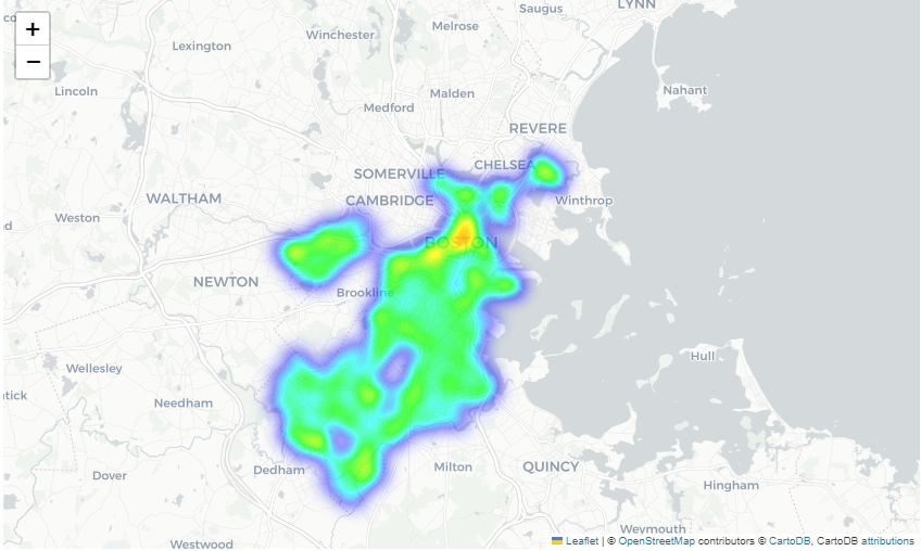
대부분의 범죄는 도시 중심가에서 발생한 것을 볼 수 있다.
3.4 Choropleth maps
범죄가 경찰 관할구에 따라 어떻게 다른지 이해하기 위해 Choropleth map을 생성한다. Choropleth map이란 지리적 영역에 따라 데이터 값을 시각화하는 방법 중 하나이다. 이 맵은 지리적 영역의 다양한 영역에 대해 다른 색상 또는 색조로 구분된 데이터를 표현한다.
# GeoDataFrame with geographical boundaries of Boston police districts
districts_full = gpd.read_file('../input/geospatial-learn-course-data/Police_Districts/Police_Districts/Police_Districts.shp')
districts = districts_full[["DISTRICT", "geometry"]].set_index("DISTRICT")
districts.head()| geometry | |
|---|---|
| DISTRICT | |
| A15 | MULTIPOLYGON (((-71.07416 42.39051, -71.07415 ... |
| A7 | MULTIPOLYGON (((-70.99644 42.39557, -70.99644 ... |
| A1 | POLYGON ((-71.05200 42.36884, -71.05169 42.368... |
| C6 | POLYGON ((-71.04406 42.35403, -71.04412 42.353... |
| D4 | POLYGON ((-71.07416 42.35724, -71.07359 42.357... |
#plot_dict : 각 구역별 범죄 발생 건수를 보여주는 Pandas Series
plot_dict = crimes.DISTRICT.value_counts()
plot_dict.head()D4 2885
B2 2231
A1 2130
C11 1899
B3 1421
Name: DISTRICT, dtype: int64
plot_dict가 districts와 동일한 인덱스를 가져야하는 것 이 매우 중요하다. 이를 통해 코드가 지리적 경계와 적절한 색상을 매칭시키기 때문이다.
# 지도 생성
m_6 = folium.Map(location=[42.32,-71.0589], tiles='cartodbpositron', zoom_start=12)

# Add a choropleth map to the base map
Choropleth(geo_data=districts.__geo_interface__,
           data=plot_dict,
           key_on="feature.id",
           fill_color='YlGnBu',
           legend_name='Major criminal incidents (Jan-Aug 2018)'
          ).add_to(m_6)
m_6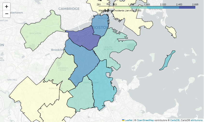
Choropleth()에 매개변수로는
geo_data: 각 지리적 영역의 경계를 포함하는 GeoJSONdata: 각 지리적 영역의 색상을 지정하는 데 사용될 값을 포함하는 시리즈key_on: 항상 feature.id로 설정된다. (이유로는 GeoJSON은 "features" 키를 포함하는 딕셔너리로 구성되어 있는데 각 feature는 고유한 식별자를 가지고 있는데, 이 식별자는 "id"로 나타나진다. 따라서 key_on을 feature.id로 설정하면 folium은 geo_data의 각 지리적 영역과 data의 값들을 해당 feature의 "id"와 일치시켜 매핑한다.)fill_color: 색상 척도 설정legend_name: 맵의 오른쪽 상단에 위치한 범례의 레이블 지정
'Programming' 카테고리의 다른 글
| kaggle : Geospatial Analysis ② (0) | 2023.04.09 |
|---|---|
| kaggle : Geospatial Analysis ① (0) | 2023.04.09 |
| kaggle : Intermediate Machine Learning ② (0) | 2023.03.19 |
| kaggle : Intermediate Machine Learning ① (1) | 2023.03.18 |
| Python 백준 1269번 : 대칭 차집합, map(int input().split()) 의미 (0) | 2023.02.14 |